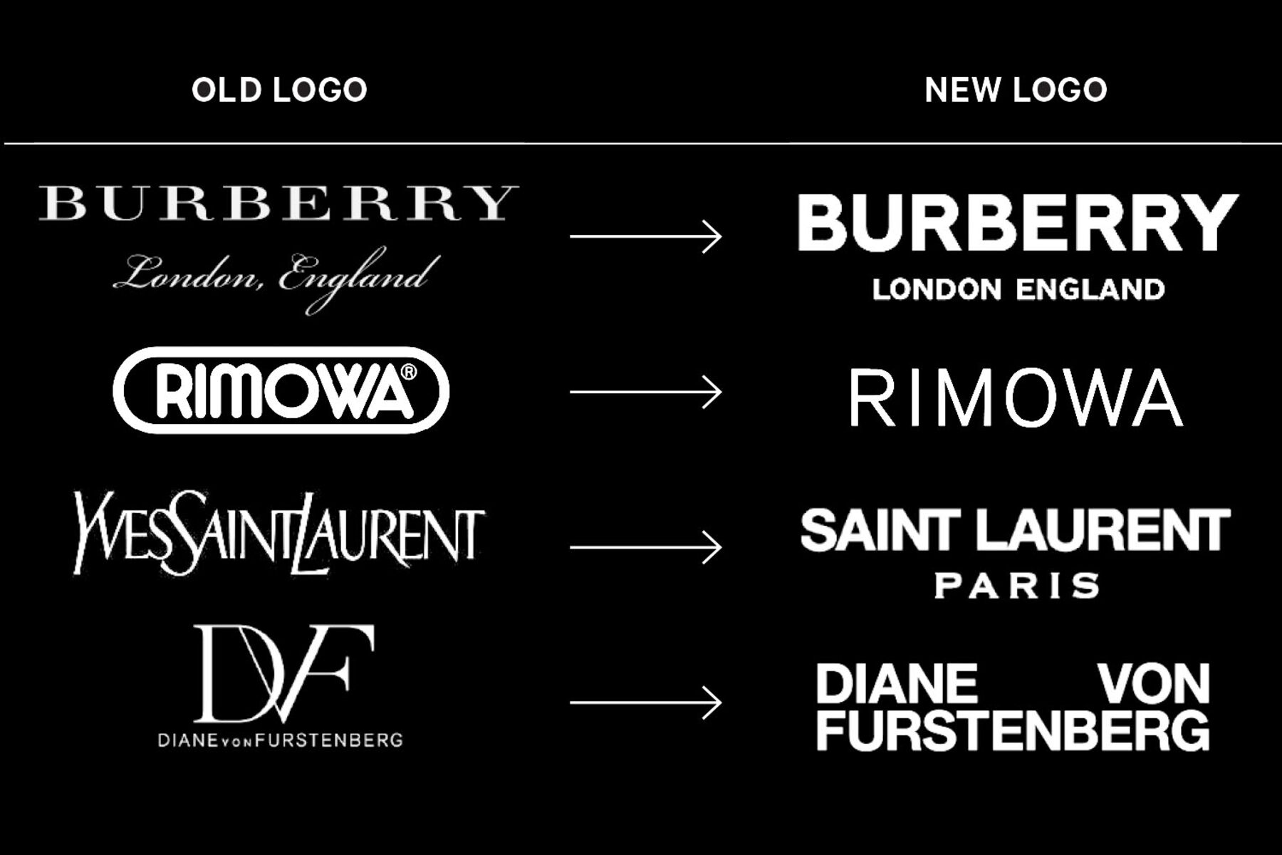
I thought it would be appropriate to research into the typefaces commonly used within the fashion industry as it would need to give off this aesthetic but also contrast well to the handwritten main title within the logo.
They all seem to use similar typefaces ...
The new logo (Burberry) has a heavier, bold look with a geometric sans-serif treatment. It’s louder, like a sticker on a skateboard—or one used to vandalise a venerable government building. It was created by graphic designer Peter Saville, famous for his Factory Records album covers in the 1980s and, more recently, for his work with Lacoste, Tate Modern, and Yohji Yamamoto.
“It is no more different nor more or less interesting than any other fashion sans-serif logo.”
luxury isn’t about mimicking trends. It’s about a timeless and enduring form of value: current yet classic, expensive but worth it. The new Burberry logo isn’t very different from those of other fashion brands, but that’s also by design.

No comments:
Post a Comment