(each time a problem occurs the process is stopped and then repeated again)

Initially I designed the menu button to be in the top left of the screen and when tapped it would move the current content over to the right and open up a list of the sections. This works well, but when linking all of the art boards to make them interactive for the prototype it began to be hard to ensure that every single design had been taken into consideration. To solve this problem I could design it so that the menu is a completely new art board, meaning that all of the screens could be linked to the same menu without making it complicated.

The feedback session highlighted the fact that this app is being published to enable quick reading and instant access to a number of creative articles of interest to the user. This means that the initial layout shown above will not work well for this. The adaptation sketches made after the feedback session looked at the ways in which I could present enough of the article on the timeline, but also providing the options to access the article from the original website it was sourced from. This would mean the development of some icons/buttons and then also maybe a drop down expansion of the paragraph to the side of the image.

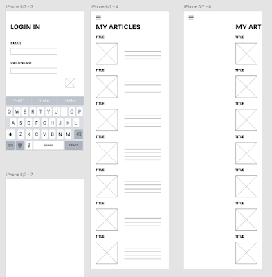
The articles section has now been adapted to enable a quick read and also the option for expansion. The first screen has a long scroll of articles that will be of interest to the user as it is all based on their previously liked content. There is the title, an image taken from the article, a short description and then 3 buttons which will display the length of time estimated to read the full article, a link to the website of source and then also a like button. The user will also be able to tap on the writing for it to drop down into a longer version of it. I have designed it to have enough space for the article to engage the user, but still focusing on the idea that the app is for a quick read and ease of use.

This screenshot shows the development needed to be able to link up every article to expand if the user clicks the text. I have designed an art board for every possibility and then I will be able to link it so that it all works. I would like to design it so that only one article can be expanded at one time to ensure that the timeline does not get unorganised and make the use of the app harder than needed.

As I was designing the Discover section, I received feedback highlighting the fact that articles could be missed if I was to have section titles such a 'graphic design', 'illustration', 'geometric' and 'colour' as there are a lot of cross overs within them. To resolve this problem the discover page will be a randomised selection of articles that may be of interest to the user. They will then be able to click on the article if they like the look of the image and the title and then it will take them to the full version where they can like it or access the original website of source. This has lead to the decision that the app would work better if there was a search bar in the menu so that key words can be searched for if the user is looking for an article about something specific. This will work in the same way as 'Pinterest', allowing for lots of keywords to be entered at the top to maximise the suitability of the articles.
Once I had started to draw out the interface wireframes, I wanted to get started on the designs and looking at how the app would work as a whole, something the design would influence a lot. So I began to think about the overall visuals, as this would influence the layout and way in which the user would interact with the app.
Once I had started to draw out the interface wireframes, I wanted to get started on the designs and looking at how the app would work as a whole, something the design would influence a lot. So I began to think about the overall visuals, as this would influence the layout and way in which the user would interact with the app.
No comments:
Post a Comment