 |
| fig. 1 |
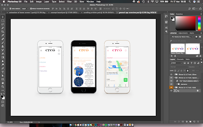
I have got a template of three iPhones in a horizontal line which will allow me to showcase three aspects of the app at one time. I then thought that I could have one spread for each of the categories as a way of showing the user interaction with the app. For example, I could have one spread of three showing the process of using the articles section of the app, the first one being the scroll of articles unexpanded, then the one expanded and then finally it linking to the source website (figure 1).
 |
| fig.2 |
 |
| fig. 3 |
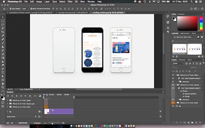
To improve this concept further, the first iPhone could have the video of the scrolling throughout the articles so that the user can become aware that there is scrolling throughout the app and then the other two will be still of the main features within that section. Figure 2 shows the smart object screen adding an mp4 video to try and have that work and play alongside the still images. Figure 3 shows a software problem with this idea, the video disappear before the phone screen because even when on a loop it is not working as a whole. I will need to research into this problem and see if I can find a solution in order for it to work smoothly.
Animation solution
As a solution to the problem of the video not playing whilst the back ground stayed still, I decided that After Effects would be a better software to create this mockup in.
After Effects is a software used to create cinematic movie titles, intros, and transitions. The software is good to animate things such as logos and layouts, helping the design to speak for itself and inform the user on what it is capable of doing. As it is an Adobe software it is able to work alongside the other softwares such as Photoshop.
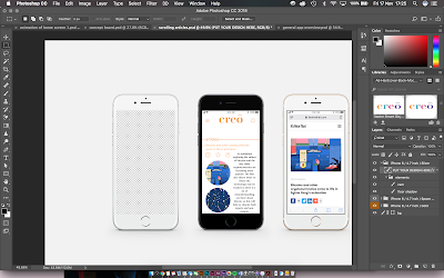
I found that I would need to take the iPhone template and have the two images that will be still placed on it and then remove the background (figure 4) on the iPhone that the animation will be placed on. This will allow for the video to be placed behind it and the edge of the iPhone will cover it and prevent it from looking as if it is floating.
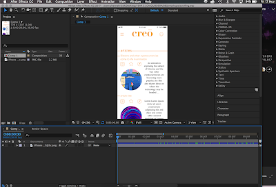
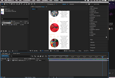
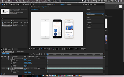
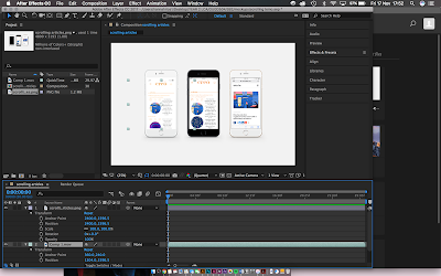
The animation of the scrolling through the app was created on After Effects, starting with the first part of the screen as a key frame (fig. 5) and then 3 seconds later the image was set to have scrolled the whole way to the bottom of the screen and set as another key frame (fig. 6). The 2 key frames were then copy and pasted every 3 seconds to create a 30 second loop that will be played as a final video next to the still images. This animation was then exported and the Photoshop image was imported as a new composition. Figure 7 shows the Photoshop image on After Effects and then after also importing the video, it needs to be placed behind the video and resized to fit in the phone screens area. Figure 8 shows what the layer arrangement looks like in order to have the video working alongside the still images.
Figure 9 shows the final animation of how the articles section of the app works. This mock up was created so that the articles section could effectively be presented to show that the user can scroll through the list of articles before they then click to expand the one of interest and then get redirected to the original source if that is what they choose to do. It is important to present the app in a number of ways so that the user can get a real idea of exactly how they would be able to interact with it as an interface and understand exactly what features it has to offer.
 |
| fig. 4 |
 |
| fig. 5 |
 |
| fig. 6 |
 |
| fig. 7 |
 |
| fig. 8 |
 |
| fig. 9 |


No comments:
Post a Comment