Overall the OUGD504 module was one that I enjoyed, but have learnt a lot from. Studio Brief 1 was a little harder in terms of time management because of the sudden change of project purpose and swapping of contents. It was a very good lesson to work with a client, but this did result in the first two weeks of the project having to be spent repeating the summer work in order to fit the new brief and then missing out of valuable development time. Working with a client has taught me that it is important to set strict deadlines between the two of you in order to not fall behind on work. Unfortunately my client took longer than expected to deliver the content to me, leaving me with a lot less time that needed to complete a large number of experimentations and developments. In order to account for this change of brief by the uni it would have been beneficial to also extend the time in which we were given to work in it.
Once the content had been exchanged I did then find this a really useful way to ensure that I was only concentrating on the best ways in which to present the content, rather than writing the content based on how I want the design to visually appear. The large number of pages needed for this publication was a good opportunity for me to develop my confidence with layouts and working on maintaining consistency throughout the design. The use of a modular grid, a multiple of set image sizes, set typeface choice and size and then also the text alignment, visually I maintained consistency.
In terms of production, I am happy with the overall outcome of the prototype as it has been said to look professional and well put together. If produced in industry, the design idea to use foiling on the front cover would have been successful. this was resolved by redesigning the front cover and although it isn't the original intention, it still works with the rest of the books visuals. The printing quality is also something that would be improved if printer on industrial laser printers. I am happy with the overall print as the colours are vibrant and transferred well onto the chosen stock of Olin Regular.
Studio Brief 2 was the most enjoyable brief as designing for screens is something I have not had much experience in, meaning that I learnt a lot of new skills and developed new ways in which I can work within the Graphic Design discipline. Having the full amount of time set for the brief to concentrate on developing the content, designs and final outcomes as a whole process I felt was beneficial as I could really get stuck in and work hard on the adaptations in order to create something fairly refined as a final outcome.
In order to produce a prototype of the users interface interaction, Adobe XD would need to be used as it allowed for the art boards and different elements to all be linked up in the form of a wireframe. This helped with the design process as well as the final presentation of the app because throughout development it highlighted any elements of the app that did not flow, did not function as intended and also if elements/features were missing.
To also enhance the presentation of the app and the concept behind it all, I decided to learn how to use Adobe After effects as this had been shown to be the most professional way to animate the content in which I had designed. The process was longer than it needed to be as I had never used the software, but with the help of a peer I was able to put together an animation that showed the scrolling within an app through the articles section. In order for more of us to produce outcomes to the same level that they would in the industry, it would be useful to be able to attend more workshops teaching particular skills for each of the softwares that we have not used before.
As an overall module, the way in which it began as design fro print and then ended in design for screen I found it to be very engaging because it enabled my skills to be developed in different ways ready to push in projects to come. The visiting professionals throughout this module came at very relevant times as I was able to take some of their advice or apply the ways in which they approach particular project types and use it in my projects. This enabled me to engage more with the development and production parts of the briefs as I was having to learn new methods in order to produce outcomes of a particular standard.
Sunday, 19 November 2017
Guide Book - Final outcome / Evaluation
Design for print evaluation
Overall the book fulfils the client’s needs and visually the
book represents the content in an appropriate way through the use of layout,
alignment, typeface and colours. The minimal layout work swell to aesthetically
present the information within the book, ensuring that the writing is seen to
be legitimate and trustworthy but also engaging the reader by presenting other
elements in more experimental ways. The perfect binding was proven to be the
most appropriate binding method visually and practically. The method allowed
for the spine to be squared and also for two different thicknesses of stocks to
be used, positively adding to the user interaction within the book. The choice
to use right alignment of text for the majority of the book was subtly representative
of the content within, working positively to make the final book a little
different to other existing products. The design decision of not including a
blurb on the back of the book worked positively to highlight that the book is
more of a visual representation of the decriminalisation of the LGBTQ+
community rather than a descriptive one.
If made in industry, the foiling on the front cover would
have worked without any problems in regards to the toner reacting to the heat.
Industry standard production of the book would also improve the consistency in regards
to the printing quality, ensuring that the large blocks of colours have no patches
of lightness. To further develop the back section, having the artwork on a page
each so that all of them could be ripped out by the user would be good to
ensure that all of the pieces are treated equally. In terms of identifying each
of the pieces of art, the title and artist’s names could be presented all
together at either the beginning or end of the section.
Design for Screen - Final outcome / Evaluation
Overall the ‘creō’ application successfully presents a collation of creative articles, personalised to each user and also allows for a location search to suggest creative shops, galleries and studios nearby. The final outcome was thought to be on trend, easy to navigate and consistent, as a result of the minimal but conceptual approach to the design of the layout and visuals. The typefaces chosen within the app maintain a level of legitimacy and style, but also when transferred on screen it was clear that the legibility was also good. The feedback suggested that it was hard to see if the amount of text shown was appropriate or if the quantity was too overwhelming. To resolve this for the final presentation of the app an actual sourced article was used in the framing to demonstrate how the user would view an article, the amount of content that would be shown and how it would then link to the original website of the source.
To improve on the final outcome, Adobe Illustrator would have been a better software to do the visual designs in as the vectors would have kept the quality consistent when transferring between the different software. This would have also made it easier to create a more complex animation as all of the elements would have been transferred as separate shapes that within the software they could have been manipulated. The use of Adobe After Effects is something that I will continue to learn how to use so that in later projects it can be used to showcase the concepts and user interactions of designs.
Design for screen - Mockup developments
 |
| fig. 1 |
 |
| fig.2 |
 |
| fig. 3 |
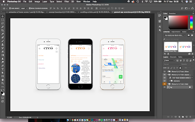
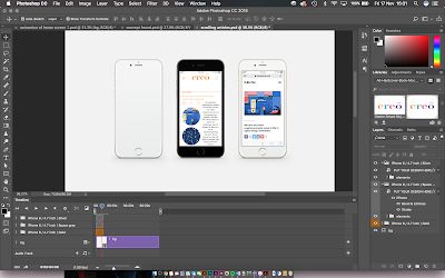
To improve this concept further, the first iPhone could have the video of the scrolling throughout the articles so that the user can become aware that there is scrolling throughout the app and then the other two will be still of the main features within that section. Figure 2 shows the smart object screen adding an mp4 video to try and have that work and play alongside the still images. Figure 3 shows a software problem with this idea, the video disappear before the phone screen because even when on a loop it is not working as a whole. I will need to research into this problem and see if I can find a solution in order for it to work smoothly.
Animation solution
As a solution to the problem of the video not playing whilst the back ground stayed still, I decided that After Effects would be a better software to create this mockup in.
After Effects is a software used to create cinematic movie titles, intros, and transitions. The software is good to animate things such as logos and layouts, helping the design to speak for itself and inform the user on what it is capable of doing. As it is an Adobe software it is able to work alongside the other softwares such as Photoshop.
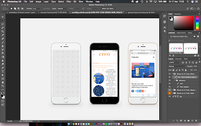
I found that I would need to take the iPhone template and have the two images that will be still placed on it and then remove the background (figure 4) on the iPhone that the animation will be placed on. This will allow for the video to be placed behind it and the edge of the iPhone will cover it and prevent it from looking as if it is floating.
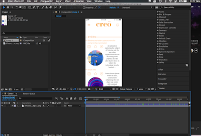
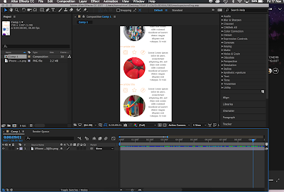
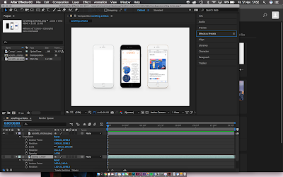
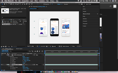
The animation of the scrolling through the app was created on After Effects, starting with the first part of the screen as a key frame (fig. 5) and then 3 seconds later the image was set to have scrolled the whole way to the bottom of the screen and set as another key frame (fig. 6). The 2 key frames were then copy and pasted every 3 seconds to create a 30 second loop that will be played as a final video next to the still images. This animation was then exported and the Photoshop image was imported as a new composition. Figure 7 shows the Photoshop image on After Effects and then after also importing the video, it needs to be placed behind the video and resized to fit in the phone screens area. Figure 8 shows what the layer arrangement looks like in order to have the video working alongside the still images.
Figure 9 shows the final animation of how the articles section of the app works. This mock up was created so that the articles section could effectively be presented to show that the user can scroll through the list of articles before they then click to expand the one of interest and then get redirected to the original source if that is what they choose to do. It is important to present the app in a number of ways so that the user can get a real idea of exactly how they would be able to interact with it as an interface and understand exactly what features it has to offer.
 |
| fig. 4 |
 |
| fig. 5 |
 |
| fig. 6 |
 |
| fig. 7 |
 |
| fig. 8 |
 |
| fig. 9 |
Guide book - Prototype photography
In order to present the book in a professional way, I hired out a space in the photography studio so that a clean background and good lighting could be used to produce high quality images of the final book. I then took the images and edited them using Adobe Lightroom, a software which is good for editing a group of images because the adaptations made on one image can be copied and transferred onto another in exactly the same way. This was useful to get the whole group to appear visually consistent, but as each image has a slightly different nature in terms of the colours on the pages etc. I had to edit them slightly further individually.
Final images
Final images
Design for Screen - Final Pinup feedback
The final pin up allowed us to get some final feedback on the apps design, how it works and anything small that could be improved before the deadline. Figure 1 shows the animation of the interface in use, allowing the group to be able to understand how the app works. Figure 2 shows the post it notes left of the good points and improvements about the app. I was then able to writing these out into a list so I knew the common things that cam up so I could then decide which parts I did need to improve.
 |
| fig. 1 |
 |
| fig. 2 |
- scrollable, on trend + fancy
- like the archived section
- simple, easy to navigate layout
- consistent
- easy to navigate
- good use of links to helpful additions such as the map and the favourites section
- looks professional
- simplicity of the layout works
- legible and easy to navigate
- good concept and would use the app
- looks professional, the video showing it scrolling is good
- circles and typeface works well together
- good colour scheme
- logo and colour scheme work well
- too much text shown, can be a little overwhelming
- animation and presentation is good
- improvements
- too much text shown, can be a little overwhelming
- more influence of the colours in the sections
- more neutral logo
- colour on title needs to be removed and only used on the apps
- give sections a colour and the title changes per section
- slow down animation so it is easier to understand
- the logo in black would suit target audience better and look less childish
- experiment with the colours
- needs a demonstration of a real article in order for it to be understand easier
- needs more segregation of sections
- adjust the colours so that the main title is neutral and the sections change colour
- make the space less crowded
In response to the feedback
The menu already had the colour scheme applied to the different categories, but only on the lines that then presented the titles of each section. To improve the overall look and maintain consistency the colour of the writing was also changed.
The section colour for the articles was orange, so after applying this to the title it then had to be decided where else it would be necessary for it to also be changed to orange. The icons were changed to orange which worked well, but the text did not read very well when it was changed to anything other than black. The text was also made central to help with the overall visual and also when tested on an iPhone 6 screen it looked better and read easily.


The apps concept would be easier to understand if there was an actual article as part of the mock up, so I added an article that I had originally put in the favourites section so that there is consistency throughout. The animation will need to be created to show how it can open up to another photo underneath and an expansion of writing. The animation will then also be able to show it go into the favourites and then show where it can be found at a later date by the user.
The feedback helped me to see exactly the parts that could be improved as this becomes hard to distinguish when you have been looking at something for such a long time. I was unhappy with the way in which the colours had been used as I didn't feel it best represented the app, but now that I have presented the visuals and had time to discuss the different options the app design makes a lot more sense and works better visually in regards to who the target audience is. With the new colour scheme and overall design visual, it was thought that the app suited the target audience better and also had a higher level of legitimacy in terms of it providing factual articles to the user.
As a result of the change in visuals for the app, a new home screen logo needed to be designed so that it represented the overall visuals of the app. The lines that are present throughout the whole interface were taken and designed to appear to weave in and out of the letters. The design is minimal but accurately represents the visuals of the app which is important.
As a result of the change in visuals for the app, a new home screen logo needed to be designed so that it represented the overall visuals of the app. The lines that are present throughout the whole interface were taken and designed to appear to weave in and out of the letters. The design is minimal but accurately represents the visuals of the app which is important.
Now that the app design has been finalised the prototype can be linked up so that it works in order for the user to understand exactly how the content works with each other and to test the user interactions with the interface. The app prototype was developed using Adobe XD as the tools allow for each of the elements to become interactive in a way that it would appear on the users phone screen.
Subscribe to:
Comments (Atom)


