It is interesting how as designers we are always questioning which colour is the most appropriate to use for our designs. We search through the internet looking at trends, colour swatches and existing pieces of work, when we only need to look around us at the everyday environments we immerse ourselves in.
‘Pantone your street’ allowed me to realise just how much inspiration surrounds me every day.
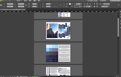
I chose to base my pantone swatches on a street that I pass each morning on the way to the studio, allowing me to focus on the idea that everyday inspiration often goes unnoticed.
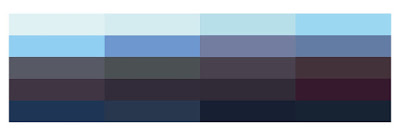 |
| Colour Swatch |
To start the design process of the booklet, I placed the colour swatch at the top of the page so I could refer to it and base all my designs on whether or not they would work with the selected colours. I had decided that I wanted to design a front cover made up of tracing paper with the printed design on, wrapped around the plain coloured card. I went to the local art shop and selected a pale blue that complimented the colour swatch and would be light enough for the tracing paper design to stand out on top of it.
I did some of the design work for the inside pages before I attempted to look at the front cover design, allowing me to notice any trends within the overall design.
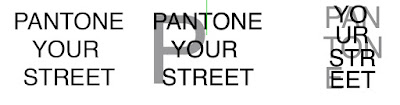 |
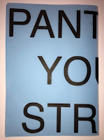
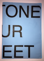
| Front cover development |
 |
| Back |
 |
| Front |
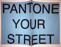
I started with a simple capital letter, Helvetica as the type face wrap around cover. I wanted to see if the idea of wrapping the text the whole way around the book would look effective, or if it would look too disjointed. To test out the idea, I printed a rough copy of the design onto tracing paper and folded it over some blue card. It was evident that it didn't work very well with the particular title as some letters were cut off at odd sections and it didn't spell anything interesting on either side. I could develop this idea in different projects as some titles would allow for a 'pun' or an interesting word to be displayed on the front, sticking to the same concept as this.
 |
| Double page spread |
 |
| Final design mock up |
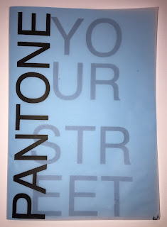
This mockup was more visually successful than the first as it clearly displays the title of the book. The use of the different opacities works well to allow me to use an interesting layout with overlapping. This makes the aesthetic more visually engaging, also sticking to the layouts within the book, matching the other pages and how they are designed.
 |
| Final front cover |
 |
| Layout mock up |
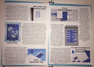
I found it hard to decide whether or not I wanted as much information on each page as possible, or to keep the book fairly minimal and have the information evenly spread throughout. I thought that the best way to see if the pages were too crowded would be to print them off in A5 and see what they would look like at this scale, rather than on the screen. I decided that the layout was too crowded, impacting on how the book would be read and engaged with. I continued the development by working on each example as a separate page and this work much better.
 |
| Illustrator file |
 |
| InDesign file |
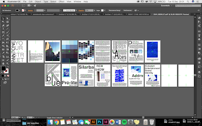
The illustrator file shows all of the pages that are to be included in the book. I did the design work on Adobe Illustrator as that is the programme that I am most comfortable with as it is what I have done the majority of my design work on. I then set up the InDesign file to have 16 pages in 9 spreads, ready for print. I copied over the Illustrator designs onto each page and then the book was ready for print.
 Once the pages were printed, I had to individually cut each of the pages following the guidelines and using a scalpel and a ruler. I then had to use the machine to create a perforated fold in each of the pages, so that the thickness of the paper would be a problem when folded and stapled. I had to do a couple of practise fold with this machine because I initially found it very hard to line up with exactly where I wanted it to go.
I could then put it all together and in order and cut it all down using the guillotine, meaning that each of the pages would line up and be exactly the same size.
The final step was to then use the spine stapler to hold it all together and allow it to function as a book.
Once the pages were printed, I had to individually cut each of the pages following the guidelines and using a scalpel and a ruler. I then had to use the machine to create a perforated fold in each of the pages, so that the thickness of the paper would be a problem when folded and stapled. I had to do a couple of practise fold with this machine because I initially found it very hard to line up with exactly where I wanted it to go.
I could then put it all together and in order and cut it all down using the guillotine, meaning that each of the pages would line up and be exactly the same size.
The final step was to then use the spine stapler to hold it all together and allow it to function as a book.


 Once the pages were printed, I had to individually cut each of the pages following the guidelines and using a scalpel and a ruler. I then had to use the machine to create a perforated fold in each of the pages, so that the thickness of the paper would be a problem when folded and stapled. I had to do a couple of practise fold with this machine because I initially found it very hard to line up with exactly where I wanted it to go.
No comments:
Post a Comment