Saturday 31 December 2016

@DRME_STUDIO - visiting professional

"Make good shit"

The visiting professionals DRME Studios came to talk about their individual journeys to where they are now within the Graphic Design industry. They mainly focused on the fact that you can be just as successful without needing to be based in London, something many people associate to be the place to be for the creative industry.

Mike Perry - 'My mother caught me doodling'
Asking was the one thing that they saw to be most valuable and successful tool to accessing opportunities in the creative industry. Knowing that they were going on a trip to New York, they organised a meeting with Mike Perry Studio and landed themselves a 2 month internship the following summer. 

'365 days of collage'

The '365 days of collage' started as a personal project, as a way to use found imagery and personal photography that they had collected over the years and to also promote themselves as designers. The daily images became very popular to those following their design work because they posted at the same time each day on instagram and people started to notice. The aim was to changing perceptions and create new worlds. They sold the images online each day at a small price, so that they were available to everyone.This lead to their work being displayed in 'HOME' Manchester's exhibition

It is important to set yourself challenges and goals so that you grow as a person and a creative individual. I do not plan to commit to making a collage everyday, but it is something I would like to have a go at maybe weekly or monthly throughout 2017. It is a field of design that I have always used as inspiration, but I have yet to try it.  

"Do it for the love and then you'll get good shit at the end"

Advice:
- "Make good shit" 
- Collaboration is where opportunities are made
- "See shit"in galleries, new cities or new countries
- "Be fucking brave" 
- "Just ask" as jobs arise from this
- "Just be you" and do not only follow the trends

http://www.dr-me.com/ 

Thursday 29 December 2016

Studio Brief 2- Task 6

Photographic constraint
- Take 50 colour photographs of your object (cassette tape) following a constraint or limitation that you set. Each photograph must consider how it is communicating the connecting constraint through the series.

I decided to have the constraint as 'focus' for the series of photographs. This allowed me to closely investigate the parts of the cassette tape and showing the different sections in a variety of realistic and abstract ways. 

The shadow photographs that show the shadows are interesting as it allows for the overall structure of the tape to be displayed and the focus is taken away from the aesthetics of the packaging. Figure 1 focuses mainly on the section of the tape that exposes the reel as there are some interesting patterns and shapes that can be taken from these sections.

The final 5 photographs clearly show the constraint of focus as the order in which I have arranged them shows the progression from full focus, to small areas of focus, to no focus. 


Figure 1
Figure 2
Final 5 photographs 


Studio Brief 2 - Task 5

Task 5
- Explore your object typographically 


Figure 1


Figure 2
Figure 3

Figure 4
Figure 5
Figure 6

Figure 7


Figure 8

Figure 9
'CHICAGO IX' (Figure 1) is well known, following the style of many other cassette tapes. Research lead me to find out that most cassette tapes use variations of the font 'Impact' (Figure 2) on the front of the covers, often in a very bold red. I also found that the majority of writing on a cassette tape was in uppercase rather than lowercase. I created a simple vector design to represent the cassette tape so that I could incorporate it into the typeface 'Impact'. I placed the image in the centre of the 'P' and also the 'A', but changed it from a rectangle into a flat-topped triangle. Figure 5 attempts to illustrate the movement that takes places within a cassette tape in order for the sound to be generated. I then thought it would be interesting to look at how I could build up the shape of the reel and show how it works using only the word 'cassette tape'. Figures 6, 7 and 8 show the development stages that I took. I realised as I was designing at the tape relies on the perfectly circular reel to be able to spin and pass the tape around to where it is needed. I decided to combine a few of the ideas together to produce something that resembles an actual cassette tape, relying on lines and typography only. 


Studio Brief 2 - Task 4

Study task 4 
- Recreate a piece of music in Adobe Illustrator

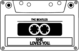
I decided to base my work on the charts number one single in 1963 which was 'She loves you' by The Beatles. 


Figure 1

As the music video is about love, I decided to recreate the cassette tape reels into the shape of the infinity symbol which symbolises never ending love, as seen in figure 1. I chose to change this feature on the tape because it is one of the most recognised, so although it is a change, it will be noticed. 


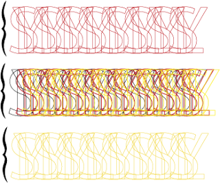
Figure 2
The chorus of the song has a lot of repetition of the words 'she loves you', so this is represented by taking the 3 first individual letters of the words and overlapping them slightly to create a shape that is repeated into a line (acting as a stave), as seen in Figure 2. The colours represent the colours found on the album cover of the song. This recreation clearly illustrates the repetition of the words to the musician. 

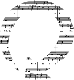
Figure 3

The symbolisation of the rotating motion of the tape reels is represented in Figure 3, a necessary movement for the cassette tape to play music. The shape is made up out of the sheet music for the song, directing the musicians to use the notes visible to interpret how they want to play the song.


Figure 4
This is a section of the original sheet music, vectorised and then the gaps that have been created marks out roughly where the notes should be. It is a subjective way to represent the notes of the piece of music also insinuating the age of the song by making the bars look slightly damaged and old.


Figure 5
Figure 6
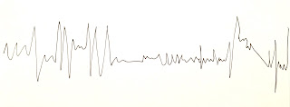
Music is often seen to be very personal and it is likely that each person has their own opinions on particular songs. I wanted to illustrate this personal attribute, but also show the accurate representation alongside. The grey in Figure 5 is an accurate sound wave of the song, 'She is Love'. The red overlay is my personal interpretation of the first 40 seconds of the song. I held my pen on a piece of paper and drew the up and down movements I felt to match the song and its changes in words and volumes etc. Figure 6 shows the original drawing before I converted it into vectors on Adobe Illustrator.

Studio Brief 2 - Task 3

Task 3
- 10 drawings related to your object using a spreadsheet program (excel)


Figure 1
Figure 2
A lot of the designs are fairly conceptual as I think these are more interesting, but Figure1 and 2 are drawings made on the spreadsheet with the intention for them to look as similar to the cassette tape as possible. I used different shades of grey to make the different layers and shapes on the cassette tape stand out as much as possible.

Figure 3

Figure 4
The song 'c30, c60, c90, go!' by Bow Wow Wow was the first single to ever be recorded onto the cassette tape, so i thought it would be important to include this somehow into the designs. Figure 3 and 4 show the bar chart style of design to represent the chorus of the song. The 3 squares high stands for 'c30', 6 squares high stands for 'c60' etc. I looked at the chorus and ordered the bar height arrangement into the order that the numbers are sung. Figures 3 and 4 show two different interpretations of the chorus.


Figure 5
I found a screen printed poster from the 60s that was used to promote the release of the song, so I drew out the word 'GO!' onto Excel and then used the exact colours that were used on the poster.
Figure 6

Figure 7
As the cassette tapes main function is to provide the user with sound, I thought it was necessary to once again look at the different ays that a sound wave could be presented. Figure 6 and 7 focus on trying to show the different layers with in an individual song, having a different style of 'wave' to represent each instrument and part. 

Studio Brief 2 - Task 2

Task 2
- 10 conceptual pictures of your object in a text-editing program (pages)


Figure 1
Figure 1 is a recreation of the basic outline of the cassette tape using only horizontal lines. The variation of thicknesses add an element of depth and show the 3D aspects on the cassette tape. 

Figure 2
The tape reels are essentially the most vital element of the cassette tape as they create the movement so that the tape can then pass through and the sound can be created. Figure 2 shows a tiling of the individually designed reels, a fairly geometric approach to represent the large amount of straight edges on the design of the cassette tape. 
In contrast to this, Figure 3 and 4 focus on the depth of the tape reels and how they concave into the actual case structure itself. Figure 4 is also working to represent the spinning movement of the reels, as well as the depth. 


Figure 4
Figure 3

Figure 5
A lot of the personal memories of cassette tapes that I found when looking through blogs and different articles we all very reminiscent on the mount of times that the tape unravelled and came completely out of the tape, getting all tangled and caught around everything. I wanted to visually show this in Figure 5, showing the tangled lines by overlapping all of the circles and representing them in a circle way to show the spinning movement once again.

Figure 6
Figure 7
I thought it would be interesting to explore the shapes and patterns on the cassette tape that people may not notice. Figure 6 shows the holes at the bottom of the cassette tape that are around the tape section. Figure 7 is the section across the bottom of the case and the cut out sections are represented by the darker shapes with the lighter strip across the middle.

Figure 8
Figure 9


Figure 8 and 9 are very conceptual and are my own interpretation of the spinning of the reels. I decided to use rectangles in Figure 8 rather than the obvious choice of the circle. The rectangle shows the shape of the actual case of the cassette, something more interesting than just using the circles. Figure 9 uses a mixture of the circles, rectangles and triangles to visualise all of the different elements of the cassette tape and how they all layer up to create a 3D object. 
The final design, see Figure 10, very simply shows a pattern that symbolises the shape of the sound wave using vertical lines. Repeated in different colours and overlapped etc. could be very interesting if I was to further develop this. 


Figure 10

Tuesday 27 December 2016

Study Task 3: Contemporary Blackletter development


To make the most of the practical session, I had researched Blacklettering in advance and had ago at reproducing some of the letterforms using the flat nib of a Promarker. This allowed me to realise that the Blackletter style actual focuses on the different sections of the individual letter and how they are out together. I learnt the order in which the strokes are made and the direction in which each section is created surprised me as I was practising. The main feature that I will need to carry through to my contemporary designs would be the idea that the tool being used to make the mark does not change direction, allowing the high contrast lines to be created.


The image above shows some of the markings that I made to represent the different symbols of the signage system that would be needed within a public space such as a hospital. I photographed each sheet individually and could then vectorise them in Adobe Illustrator to see if I could then develop a wayfinding system. 


I experimented by cutting out the shapes created and then cutting them up and putting them back together to see what kind of patterns could be created. I then did a series of different lines with a number of different paint brushes and changed the consistency of the ink. This allowed me to see what kind of textures, colours and shapes could be created and applied to my final outcome.

Cutting out and arranging all of the experiments into my sketchbook allowed me to see that it was the elongated design that worked the most effectively. It has the high contrasted strokes that would be found in Blacklettering, but the elongation adds the contemporary twist to it all. I can now focus on how I can apply this design rule to all of the other symbols that will be needed in the wayfinding system. 


Elongated design
The fact that Blacklettering is made up of separate strokes to create one letterform inspired me to try and develop the symbols in this same way. I looked at the shapes that were used in the particular symbol and spent time drawing them all out individually. I repeated the process so that I had a large collection that I could cut up and collage together to create the desired symbol. 

Screenshot of Illustrator developments
I scanned in all of the ink drawings and then image traced them all so that I could individually change all of the vectors and manipulate them to create the final symbols for the wayfinding system.

Final Outcomes