Tuesday 31 January 2017

Studio Brief 2: Research

Concrete Poetry
Concrete poetry is poetry in which the meaning/effect is conveyed mainly by visual means, using patterns of words or letter and other typographical devices. This whole concept is very subjective and there is no right or wrong way to interpret the poetry. It is thought that the poetry should not be read, but should act upon the perceiver. 
The concept links to the 'semiotic poem' which looks at language and that it is based on a set of signs; limiting to a visual response. 

David Aylward

'Typescapes' is a book of Aylward's work on concrete poetry. He is an artist born in the UK, but now living in Toronto. I found researching his work interesting as there were a lot of opinion based responses, something you would expect form this. The main theme within the comments was that the work is very visual and it represents the subject in this way.


Monday 30 January 2017

Studio Brief 1: Existing Wayfinding Systems

Adidas Laces 2011- Büro Uebele

http://www.typetoken.net/typeface/adidas-laces-2011-buro-uebele/

The name "laces" has a metaphorical value as it represents the networked communications of a globally active corporation, but explicitly shows the type of products that Adidas sell. Movement is the principle of sport and it also defines the design language of turbocharged typography which will run through the new adidas design centre. The choice to use a limited colour palette could have been so that the emphasis is not taken away from the vibrant products, also providing the staff with a neutral environment to work within. The relief-style mural images in the meeting areas make each space unique, making them clearly identifiable to those using them. This wayfinding system suits the space in which it is used very well because it acts as a form of 'decoration' as well as being informative. It successfully illustrates the ethos of the company and the materials used derive from the companies products. The idea of using materials and themes within the wayfinding is something that I would like to apply to my idea. I will show the theme by using recognised colours to the particular movement (Mod).  


Grafting Architecture 

https://www.behance.net/gallery/26190981/Grafting-Architecture

Bildi Grafiks designed a visual language that could be grafted onto the city itself by integrating graphics into the architectural space, creating dialogue between the new materials and pre-existing features. This relates to my idea as I am using the existing buildings/venues and then showing the audience what it was previously like. I will need to create a supergraphic that contrasts against the existing presentation of the building but represents the past use of the building. The graphics in this consist of multiple layers fused together to allow this graphic intervention to go beyond a standard signage system. I think although the system focuses on the graphics being presented onto the side of the building, it also relies on freestanding signs throughout the city pointing the public to the specific buildings. This is something I may want to consider when designing my wayfinding system, as it may help those following the journey and also make others aware that there even is a system in place. 


Studio Brief 1: Map developments

The wayfinding system would benefit from a map that could be downloaded and printed or sourced from a tourist office etc. so that the locations are listed and made aware of. I like the visual presentation of Guy Debord's maps based on psychogeography, as they allow for individual interpretations, reflecting how the system is providing the users with interpretations and experiences of the past in Leeds.
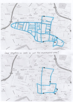
Figure 1 shows the main city centre of Leeds, the area in which the locations are contained within so that the wayfinding system can be completed by foot. I drew over the area with a colour so I could start to develop the shape that could be presented on the final map. The top map keeps a lot more detail than the bottom one, something I thought to be important. 
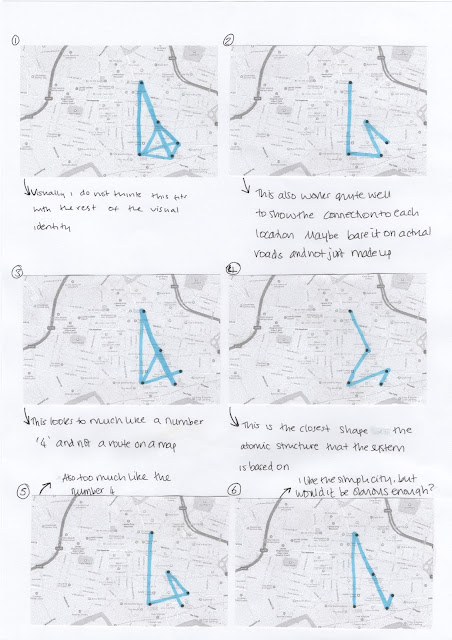
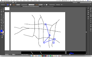
Figure 2 focuses on they ways in which I can present the route on top of the mapped background. The problem I had to work around was the fact that the joining of the locations often lead to it looking like the number 4. This is something I had to work to avoid because the number 4 has no relevance to the wayfinding system and I do not want it to become confusing. 
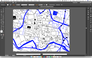
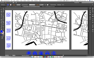
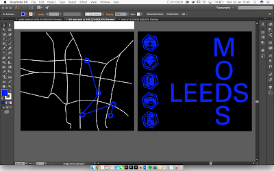
To start the map development, I imported an image of the map of Leeds and image traced it on Adobe Illustrator (Figure 3). This allowed me to visualise the details that I do and do not want to keep and decide on whether to have the background white or black. Figure 4 shows the way that the blue could be incorporated into the design, acting as a frame for the chosen area of Leeds that the wayfinding system is based in. 
Figure 5 shows the map that I drew out by manipulating all of the vectors so that they accurately show the roads within Leeds but the visual consistency has been established.
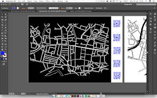
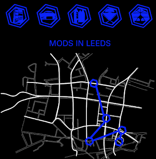
The decision on whether to have the map background black or white was made based on the fact that it would make the whole system fit together if the design style was consistent throughout. The information that is shown when scanned by the QR reader is on a black background with white text and blue imagery. Figure 6 shows that the map can be designed in that same way. The colours were removed so that the particular roads could be easily erased and re-drawn to suit the final style that I was aiming to achieve. 
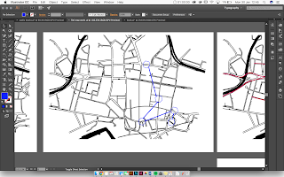
Figure 7 shows the actual route plotted out on top of the map in a shape that best resembles the atomic structure which the whole wayfinding system is inspired by. It was decided that when using a map, people look for the main roads as points that they can use to see if they are heading in the right way. This confirmed to me that the little side roads were not an important part of the map and the simplifying of this would focus the map on only the parts that made the navigation to each of the locations easier for the user (Figure 8). The simplified map with the location route plotted over the top (figure 9) visually fits more successfully with the theme of the whole wayfinding system. 
Figure 10 shows a final development of the double-sided map. It is a black background, white roads and then blue wayfinding locations, fitting with the colour palette of the rest of the wayfinding system. 
The final map (fig. 11) was designed to include slightly more details than the previous development because it makes it more informative and visually it looks more professional.
Figure 1
Figure 2
Figure 3

Figure 4

Figure 5

Figure 6 
Figure 7


Figure 8

Figure 9

Figure 10
Figure 11


Studio Brief 1: Sign development

A computer would allow me to generate a 3D sign with all of the lines and shapes that I had intended to use. Thinking practically, I had to make sure that there were no 'floating' lines because these would not work when actually physically created. 
In the interim crit, it was decided that the sign post would be made out of metal and freestanding, giving the illusion that it had been created from on single pipe and then 'blended' together to create on flowing structure.


As I had never created anything 3D in Adobe Photoshop before so I used the Youtube tutorial which showed the step by step process to create 3D lettering and I just applied the process to my sign design. I found it to be frustrating because small changes can completely distort the whole appearance of the sign post. 
I started by drawing out the sign design with the pen tool and merging all of these shapes together to create a solid shape (Figure 1). I then created a 3D extrusion so that I could change the colours and depth of the 3D shape (Figure 2). I then merged the two layers together so that I could render it all as one final shape (Figure 3). I can now use this object and pace it into context, allowing me to present my idea in a visual way that people will be able to understand. Figure 4 shows the start of how the sign could look in context. I have began to add the extended sections across the floor so that they can direct people to the locations.

Figure 1

Figure 2

Figure 3
Figure 4
The idea that the letters on the atomic structure would represent the initials of the location that it is pointing towards and the small number would represent the distance is something that I have researched into (Figure 5). I found that it may actually be more useful if the number actually represented the estimated walking time to the location as this would mean more to people than what it is in miles, preventing any conversion trouble to those not used to the metric measuring system. Figure 6 shows how it could look if it was to be created with the letters and numbers representing the location and walking time. 

Figure 5
Figure 6 

Studio Brief 1: Development research

I have found other existing examples of concepts that rely on metal being placed permanently into the floor so that I can see how it works and apply it to my design. 

Hollywood Walk of Fame


The Hollywood Walk of Fame is made up of over 2500 five-pointed stars embedded in the sidewalks along 15 blocks of Hollywood Boulevard, California. The stars are made out of terrazzo and brass.
For my idea to work, I would need to embedded the metal shape into the floor at each location. This would involve taking the section of floor out and then placing the structure down, filling around it with the cement that matches the existing flooring. 


Subway Map Floating on a NY Sidewalks

Francoise Schein created a piece that was supposed to represent the relationship between the rights of man and underground trains. The art is the familiar lines of the New York City subway made up out of brass and led lights. The piece is over ninety feet long and 12 feet wide and for it to be installed, the entire block was dug up to to install it. Although my wayfinding system isn't a piece of art like this, the same principles can be applied to the production and overall presentation of mine.


Studio Brief 1: Interim Crit

Presenting my initial ideas to a group of people allowed me to build up a body of opinions that will help me to decide which direction I need to develop my ideas. A lot of the focus of the crit was on the development on how the system will be presented out in public. The finalisation of this will allow me to then develop the visuals to suit the way in which it will be presented. 
Figure 1
My initial idea was to use tape to surround existing signs in Leeds in the hexagonal shape and then extended onto the road to lead in the direction of the individual locations. It was suggested that the sign post was actually freestanding and made out of metal. This would allow me to choose the most suitable location for them and also prevent the obstruction of existing signs in Leeds. Having the sign made up out of metal would increase the legitimacy of the wayfinding system and the idea of creating movement from one place to another would more successfully be achieved. The lines on the floor could continue from the base of the sign post and also be embedded into the floor so that the system isn't to visual polluting in the area and would not act as a trip hazard. 

Figure 2
I was unsure about how to display the pictograms and what should be at the location. Having something at the location to show that they have arrived at the particular location is important, but as they have already made it to the location, the empty hexagon may work better rather than having the pictogram visible as well. Figure 2 shows the hexagon that is the basis of all of the wayfinding systems visuals, so this displayed in the floor in the same way as the sign posts in-between the locations may work effectively. Consistency is something that needs to maintained throughout the system so that people can follow it easily and know that it is all linked.

In terms of locations and how far the line should extend for depends on the road. The straight roads will have a much shorter line because it would be fairly obvious as to which direction to walk in. The location that is displayed in Figure 1 would be a location that would have the longer lines because it is on a corner. I need to make sure that it isn't too long because at the end of the line the information is displayed and this essentially is the most important part of the sign post. 

The use of QR codes was an element to the wayfinding system that people thought would compliment it very well. The QR codes would allow visuals, information and experiences to be shared about each location. It was decided that the QR codes should be displayed on the map rather than at each location so that people can access the material without having to be at the location.

Another element that needs to be decided upon is the shade of blue that will be used throughout all of the wayfinding system. I have gathered lots of album covers that were popular within the Mod subculture and have taken swatches of the blues in them. This will allow me to choose the most appropriate shade of blue to represent the fact that it is a wayfinding system based on the Mod subculture. 

Things to work on:
Pictograms for each building
Plot the locations that the signs need to be and then work out distances
Map of the route
QR code on the map
Logo development
Colour decision
All metal embedded into the floor


Studio Brief 1: Initial ideas

Target
One of my initial ideas was based on the research into symbols that are most commonly associated with the Mod Subculture. When looking at album artwork, prints and other Mod related visuals the red, white and blue target was a common image used on a number of occasions. Figure 1 and 2 show the experiments on how it could work as a supergraphic placed at each location, with the idea that only those on the trail would understand the relevance of its placing. Although the idea could be developed, I decided that it didn't work as a wayfinding system in the way that I wanted to because it didn't really get people moving from one place to another. 

Figure 1
Figure 2

Atomic structure

Figure 3
This idea uses the atomic structure of the chemical Amphetamine (Figure 3) which was a big part of the Mod subculture's nightlife. I do not want to advertise the use of the drug, but as it was a well-known part of the subculture I think it could work well at forming the general structure of the wayfinding signs, pictograms and overall visuals/identity. 

Figure 4
The hexagon could be developed so that it works as the recognisable feature throughout the whole of the wayfinding system. It could frame the pictograms that would be used to represent each of the location, form as part of the logo, work as floor directions and also be incorporated into the typography (Figure 4).
Figure 5
Using photos I had taken of each of the locations, I started to develop vector line drawings so that I could see the distinct shapes that made each building recognisable and individual. Figure 5 shows the process in which I undertook to start to see which features could be removed and which looked best if kept. I decided that I wanted the pictograms to end up fairly abstract and stylised. This is something that I can ask opinions on in the crit so that I know which direction to take the developments in.


Figure 6
Figure 7

The idea of having the atomic structure to surround existing sign posts around Leeds using tape that extends to the floor, directing people in the direction of each location. Figure 6 and Figure 7 shows sketches of how the atomic structure could be developed to represent the direction to each place and a way of showing the distance to them.

Figure 8
Sticking to the presentation of the official atomic structure diagram, Figure 8 shows how the letters and number could be used to be informative. Using the same font which is 'Univers', The letters will represent the initials of the location and the number would be the distance in which the location is from that particular point in Leeds. 


Figure 9
Figure 10

Another initial idea is to use the tyre tread from a vespa as part of the wayfinding system, directing people to the different locations. Using the vespa tyre tread would work effectively because the vespa was a significant mode of transport for the Mod subculture. Figure 9 show how it could look if it was formed into arrows and then placed on the floor. It works well, but it is very 'in your face', something that doesn't reflect a wayfinding system that is about discovery and hidden locations. Figure 10 shows the tyre treads to be more discrete and not as obviously pointing in a particular direction. 


Studio Brief 1: Colour research

Colour research
There are a number of colours that are heavily associated to the Mod subculture, red and blue being the main two. I have yet to decide which will form the colour scheme of the wayfinding system, but to find the most suitable shade of each I created some swatches. I gathered a variety of music albums (Figure 1)that were popular within this subculture and took all of the blues and reds from the artwork (Figures 2 and 3). This allowed me to build up a collection of different shades so that I could see if there was a particular shade that seemed to be the most popular. I also got a pantone swatch of red and blue so that I could match the final colour decision to the closest shade on the Pantone system. This is important when designing because it will make the production of all of the materials much easier as printers will have the Pantone colours and costs will not have to be added trying to mix a new shade. 


Figure 1
Figure 2

Figure 3
Location research
It was important to find the locations that are associated with the Mod subculture so that I could plan where each of the sign posts and supergraphics etc. will need to be placed around Leeds. The blue dots on Figure 4 show each of the location that I am basing the wayfinding system on. I chose these particular locations because they each had a different part in the subculture, rather than only having clothes shops or only music venues. Figure 5 shows the satellite view of each of the locations so that I can see where the supergraphic will go at each of the locations. The majority of the locations have flooring outside the main entrances that will allow for something visual to be placed on the floor. Now that I have plotted the locations on the map, I can easily see where the in-between directions will need to be placed and using Google maps, I will be able to find out the exact distance from the signpost to each of the locations. 
I would like to make a map to accompany the system and make it more accessible to everyone. I would like to use the idea of psycho-geography that I have researched into and make a fairly subjective map. This would mean that people would be able to see the relationships of the locations in comparison to each other, but no accurate information would be provided. 
Figure 4
Figure 5

Studio Brief 1: Supergraphics research

Supergraphics is the revival of a trend that started in the 1960s. It was originally used by post-modernists to create the illusion of expanded or altered space, the new generation of supergraphics focuses on branding, inspirational messaging, and wayfinding. 

Supergraphics work well as decorations, but to successfully share information and direct the users in a particular way because of the vast scale that they are presented. The large scale makes it hard for people to miss the information that is being displayed, something that I will consider when designing my wayfinding system. 

NYC Subway 53rd Street Station by Robert Propper, 1977

Ace Hotel London Shoreditch by Universal Design Studio, 2013

Eureka Tower Carpark by Emerystudio, 2006

Friday 27 January 2017

Personal work

Over the course of the year, I have started to realise the importance of personal projects. The chance to be able to do something a little bit out of the ordinary constraints of Graphic Design is important in ensuring that creativity still stays fresh. I found that creating these images, I res-parked my enthusiasm towards my other projects and I started to find confidence in trying something a little bit different. The positive feedback on social media in regards to these images helped motivate me to continue to work on personal things as well as re-sparking enthusiasm for uni projects. 
The particular personal project was inspired by the visiting professionals DR.ME as I was particularly interesting in the reasons they decided to produce collages. Its all about changing perceptions and the ways in which we expect a particular object of life form to be acting or displayed.


Studio Brief 2: Initial ideas

IDEA 1 (JIGSAW)
Figure 1
The first idea was to create all of the promotional materials and activities needed for a marketing campaign that was aiming to revive the cassette tape but with the target audience of children. Technology nowadays is expensive, so developing the cassette tape for children would be good because it is affordable. It would be exciting because it could act as a collectable that would be affordable and they could swap amongst themselves. To make this idea successful, the cassette tape would need to be promoted to them as they are not likely to have much knowledge on the product. Fig. 1 shows how iconic people/objects from the 1960/1970s could be displayed in a pop art style as stickers on the cassette tapes and then form a jigsaw. This would be interactive for the children and help to familiarise them with the product and potentially spark a further interest in them. To fulfil the brief, the promotional materials and branding would also ned to be developed for this idea.

IDEA 2 (TYPOGRAPHY)
Figure 2

Figure 2


The second idea aimed to show the exploration of a typographic journey made using only the tape from a cassette. The cassette tape is run on a continuous loop of tape, so a concertina book was the most appropriate book binding method to display this concept. The idea was that one side of the concertina pages would display the unedited experimentations with the tape (fig. 2) and then the other side would have finalised vector images of the individual letters.

IDEA 3 (AUDIO BOOK)

Figure 3


Figure 3


Figure 4

The research tasks highlighted that the audio was the main function of the cassette tape, so taking that feature and applying it to the idea of books and how they can be shortened to audio books is the direction this development process would go. Audio books are listened to for ease and to reduce the time needed for a book to read, so this idea looks at how a novel can ironically be presented to show this feature of an audio book. Fig. 3 explores how the material that the book is made out of can present the concept of a shortened novel. Taking the tape and weaving it to create a textured sheet could be developed as the front and back cover of the book to show the audio function, confirming that the text inside will be a shorter version of the actual novel. Fig. 4 shows another way that this concept could be developed, the tape inside covering the words of the novel, but leaving gaps for a word every couple of pages so that a few short sentences summarising the book are created.